

Choosing the right background images for your website might seem easy, and sometimes it is, but it can often become quite difficult as well.
My first piece of advice is, don't skip this!
The visuals on your website will instantly define it's quality in your visitor's minds. And, that will be tied to you.
Never skimp on visuals, period. Even if everything else is perfect, using pixelated, drab, or confusing images will bring it all down.
I've spent many hours browsing through catalogs of images in search of the perfect one. It wasn't always easy but I found some basic guidelines that can greatly improve the process. In this post, I'll be going over some simple techniques you can use to help ensure success.
The Background Is the Background
If you're using an image as a background, that means it should not be the focus. The foreground content is the focus and the background should compliment it. Not the other way around.
Often the foreground content is text, and you want to make sure the text doesn't compete with the background image. The two examples below show how the same text is lost in the one image but is clear in the other.
Easy solution: Contrast is the key. Use contrasting colors as well as patterns to minimize competition.
Sample Header Text
Sample Header Text
Dynamic Sizing
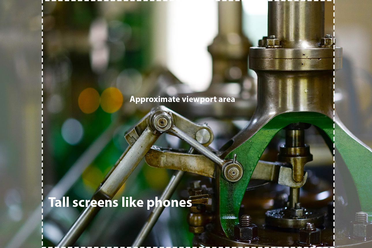
This is where I consider the image and how it will look on different screens. It might be perfect on a computer but terrible on a phone.
Screens don't just change in width but also height. Phones are tall and thin while computers are short and wide.
And, to make the image fit regardless of the screen's dimension, your image will be cropped. All this makes for some difficulties when picking out your image.
To help, use the examples below when choosing images and thinking about how they will be displayed dynamically on your website.
Easy Solution: Pick images that can be cropped severely. This means the most viewed parts are right in the middle.

Try this Example
On a computer, try resizing your browser window and watch as the images reacts.
When its wide, the image is cropped significantly at the top and bottom. But, when it's thin, those areas are visible.
Sample Header Text
Topics and Context
When picking out background images for your website, think about context.
What message are you trying to send?
Can there be a correlation between the topic and the image?
What images could represent the topic?
This can get complicated with subtle messages but it doesn't need to be.
If the topic is about sunglasses, then go with sunglasses. Maybe use a closeup, or a pattern of them, or if it's sunglasses for men, a male model wearing sunglasses would be perfect.
On the other hand, let's say your business is an environmental engineering firm but you don't have suitable pictures of your team. This is where a visual metaphor comes into play. Try using a row of trees to represent the environmental, individual, and team aspects.
Easy Solution: Don't over complicate it. If you're unsure, go with something simple like a textured pattern that relates to the overarching theme.
Sample Header Text
Where to Get Your Images
There are a lot of different places to get images. Some are free, some are paid and there is also the option of having images made specifically for you.
Whichever source you choose, remember that quality is incredibly important. I've found that a mix of free and premium stock images combined with custom images tends to work best.
Check out this post for a list of paid and free sources.
Key Points
Remember to define what it is you're trying to achieve with the element and move on from there with narrowing down what exactly it is you're looking for.
It might seem easy, but choosing the right background image can be a real challenge.
It's also very important because visitors often judge a website based on the quality of the images they see.
Use the examples above and the list below to help you pick background images for your website that will make it look great.
Basic points to remember:
- the background image is the background and shouldn't overpower
- make sure your images enhance a message, not confuse it
- take dynamic sizing into account
- prioritize readability of any overlaid text
- content is extremely important and quality is a must
- be prepared to invest time and/or money
- experiment and test
- define what you want to achieve; usually a message or theme
- when you're not sure, go with something simple
- textures and patterns are usually a safe way to go
It's not always easy but your background images can make or break your website. Pick the wrong ones and your visitors will know right away. But, picking the right ones can position you as a professional and help strengthen your messaging.
Have other techniques or helpful suggestions for picking background images? Share them in the comments below!
Share this Post