LOTUS

Humanized Diabetes Managment
Image

Role

UX Designer

Industry

Medical

Scope

Humanizing Diabetes Management

Design Tools

Figma

Buzzwords

UX Design & Research
Data Visualization
Gamification
Humanizing Technology

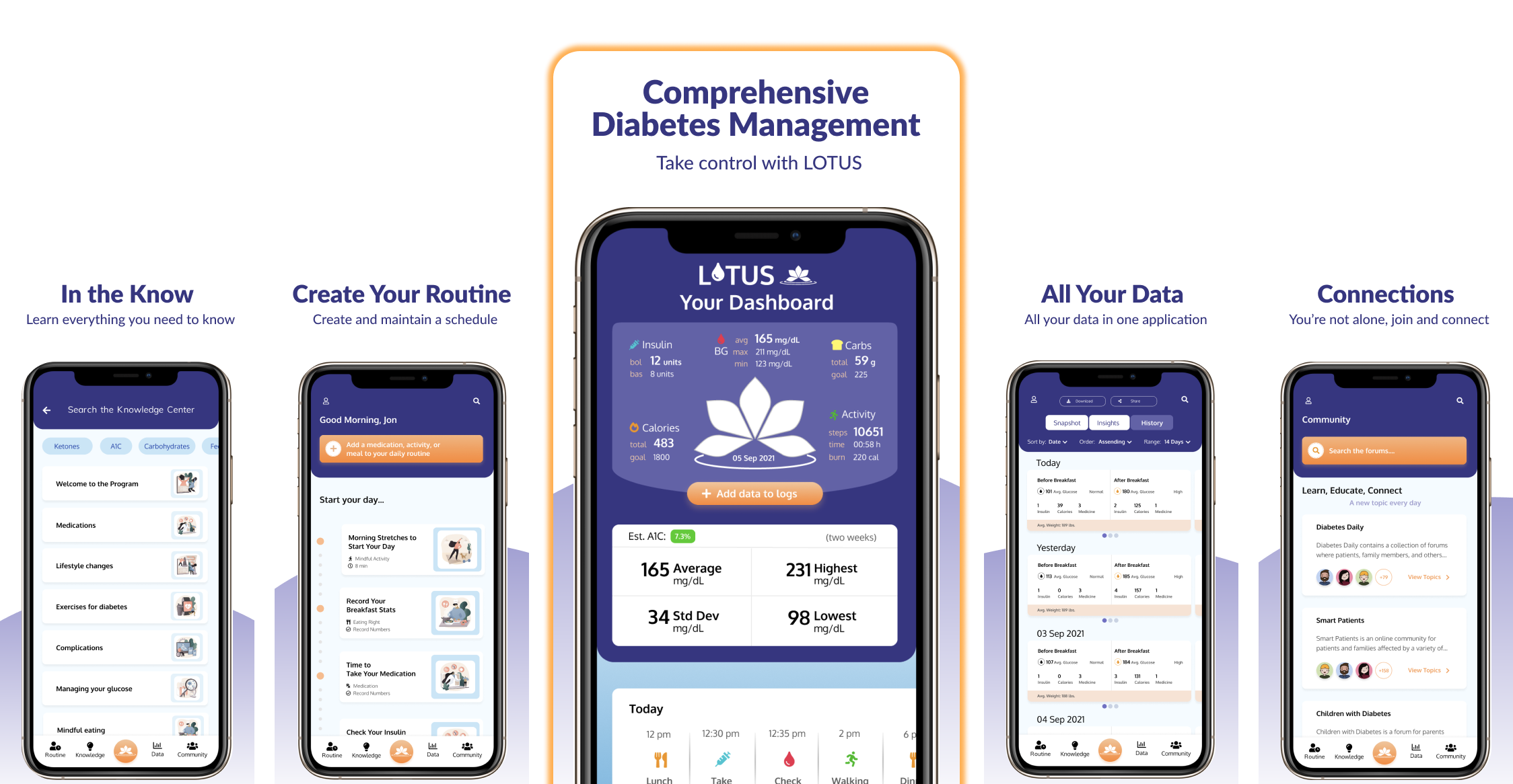
About the Project


Assess, engage, and sustain

OBJECTIVE
Design a humanistic diabetes management application that is easy to use, provides everything a diabetic would need to manage their diabetes, connect with others, and gain knowledge about the disease.

HIGH-LEVEL GOALS
  • Provide functionality that meets their practical needs
    • Routine creation and maintenance
    • Data collection and analysis
    • Goal creation and tracking
  • Show users are not alone with a community forum
  • Provide a knowledge center for users to educate themselves
  • Address the needs of diabetics by type and duration since diagnosis

UX Challenges


Addressing the needs of different types of diabetics while humanizing their experience

OBJECTIVE
Diabetics face a number of challenges that often have a significant impact on their lives. Rather than using a number of apps to achieve their goals, Lotus is designed to be an all-in-one application for all diabetics. This is a major challenge due to the functionality, flexibility, and humanistic qualities the application should possess and the resources required to design such an application. Creating a humanized resource was the initial goal, however, it became clear after researching that bringing in needed functionality would be required if the application was to provide significant value. Balancing these requirements became a challenge to designing this application.

Themes

Image

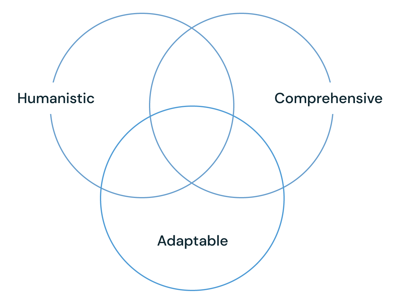
Humanistic

Professional and optimistic yet softer, more intimate look and feel as well as functionality that humanizes the experience

Comprehensive

Include everything a diabetic would need to manage their diabetes in one application

Adaptable

Adjust to different users' needs by hiding elements by diabetes type, duration, or arbitrarily


Research

Early Insights

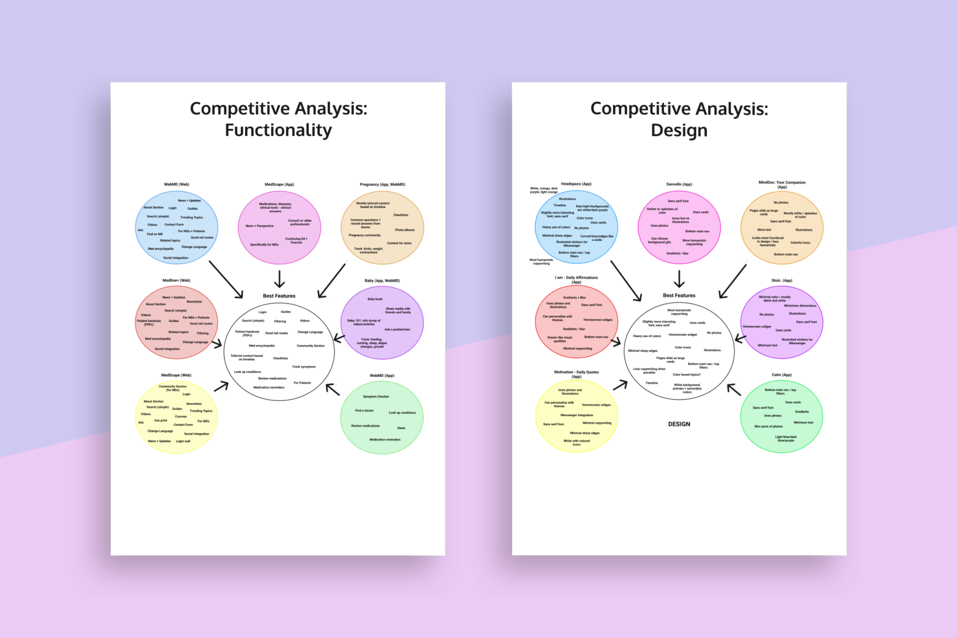
  • Competitor analysis of existing similar applications
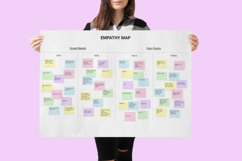
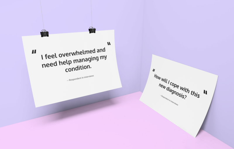
  • Preliminary open-ended interviews with likely users
  • Research different types of diabetes and their impact on patients' lives
  • Research forums and groups for insights into pain-points
Image

Interviews

Image
  • Validate the assumption that people dislike using multiple apps to solve one problem
  • Confirm people desire more humanistic medical apps that guide users
  • Define usage scenerios
  • Determine what would prevent usage
  • Define biggest pain-points

Competitive Analysis

  • Competitor analysis of existing similar applications based on design and functionality
  • Prioritized key aspects
  • Combined critical features and concepts into a central theme
  • Apps and websites from a variety of healthcare disciplines were analyzed
Image

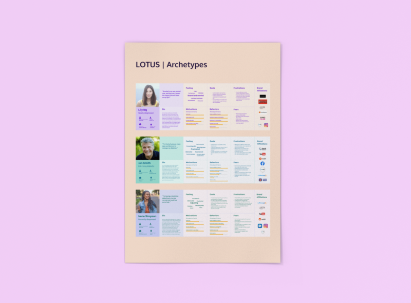
Persona Development

Image
  • 3 archetypes based on duration since diagnosis
  • Fears and frustrations
  • Motivators and behaviors
  • Feelings and goals
  • Biography and personality
  • Brand affiliations
  • 3 sub archetypes divided by diabetes type

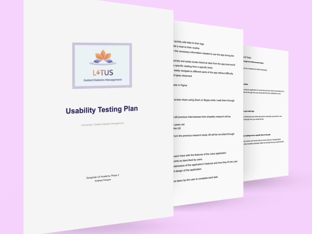
Usability Testing

  • Evaluate interactions users have with the features of the application including the onboarding sequences
  • Identify and define pain points
  • Identify successes and weaknesses of features and UI
  • Iterations based on feedback from users
Image

Ideation


Use Cases

Image

"I'm recently diagnosed and need support and access to information."

Image

"I've been diagnosed for some time and need help with managing my routine."
Image

"I'm newly diagnosed and need support with everything."
Image

"I want the app to manage my diabetes but not much else."

Design Principles

Image

Feature Narrative

Samantha is newly diagnosed and is feeling overwhelmed and insecure. She does not have any prior knowledge of diabetes, including how to manage the disease or how it will affect her life moving forward.
Ryan has been diagnosed for some time and has become confident in his familiarity with the disease. He no longer needs emotional support and rarely needs to access additional knowledge on the subject. He needs help maintaining his routine or risk letting his condition go out of control.
Owen is recently diagnosed and scared. He wants to connect with others and find an app that will make him feel comfortable and confident. He sees there are other apps available to manage diabetes but they seem too cold and not humanistic enough for his current needs and mindset.
Sara has been managing her diabetes for her entire life and is extremely knowledgeable and confident about the subject. She doesn't need all of the features but wants something that is comprehensive, easy to use, and humanistic while staying out of her way when she doesn't need it.

User Flows

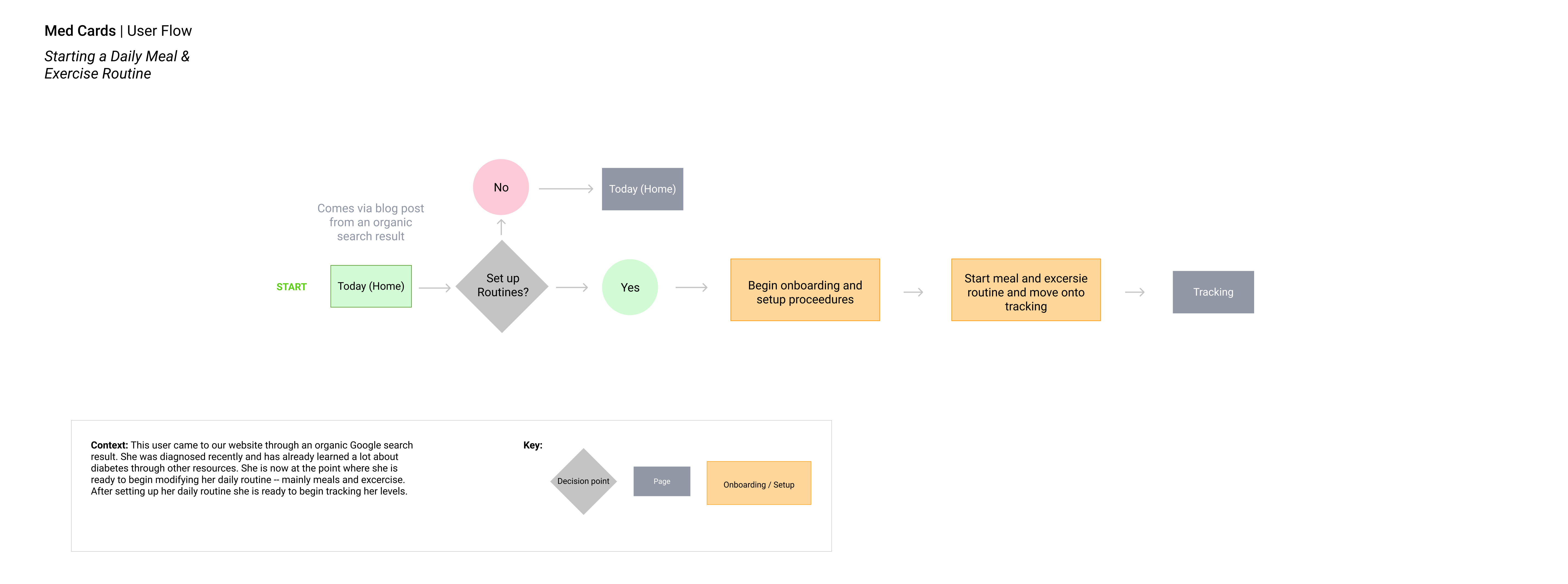
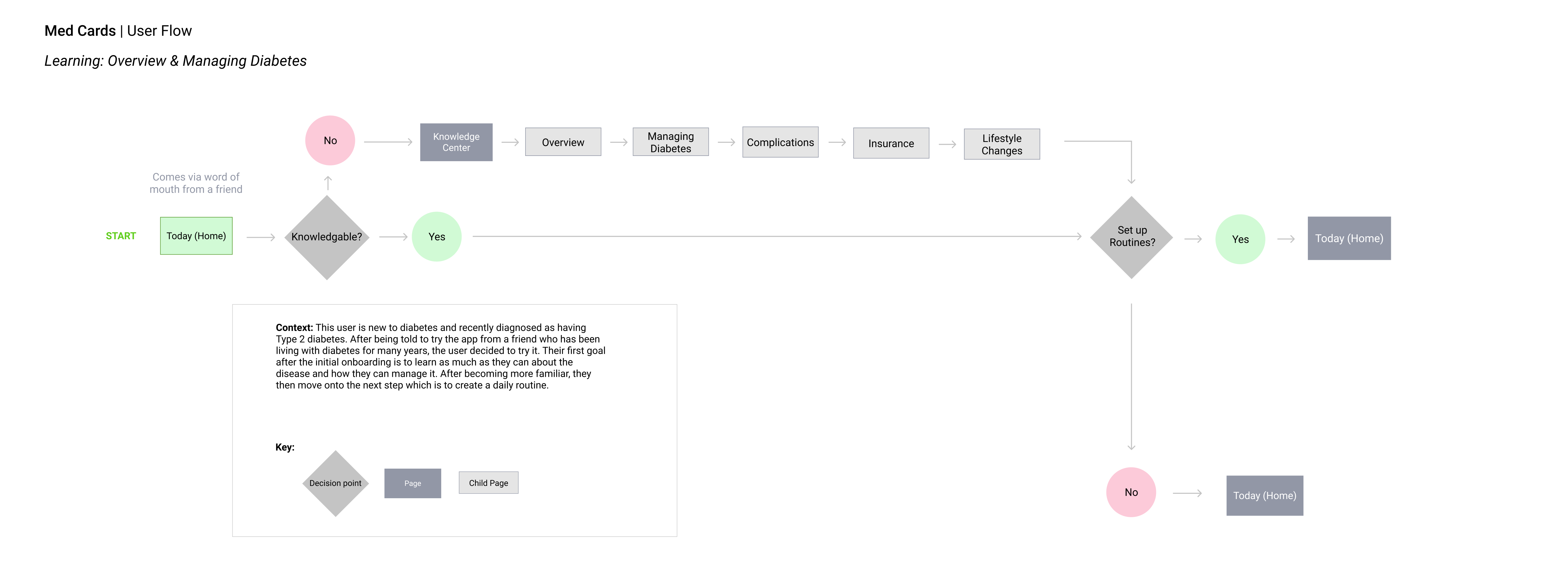
User flows were developed as part of the research conducted for this project. Below are three user flows that illustrate the main features of the application and how users would utilize them.

#1 Starting a Daily Meal and Exercise Routine
This user flow shows how a user would add a meal and exercise to their daily routines.

#2 Learning about Diabetes
This user flow shows how a newly diagnosed user would learn about diabetes within the application through its Knowledge Center.

#3 Begin Daily Tracking
This user flow shows how a user would start tracking their diabetes statistics within the application. Tracking is an important part of managing diabetes and is a central function of the application.
ImageImageImage

Design


Wireframing

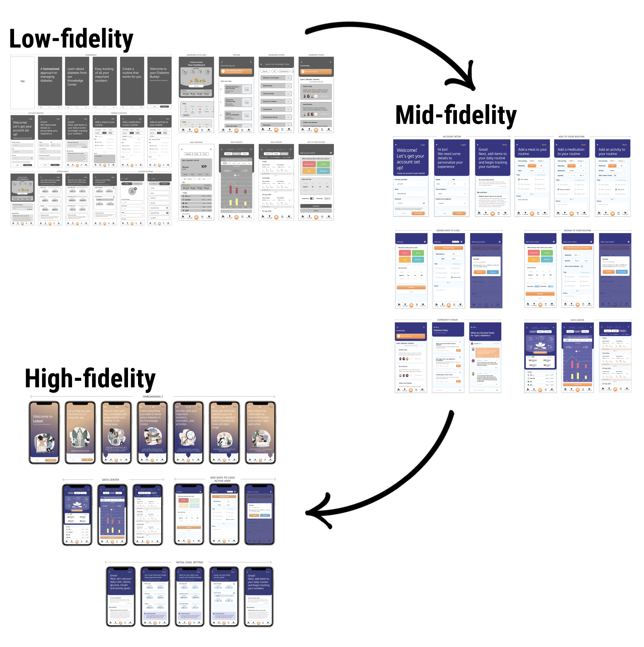
Sketching to high-fidelity wireframes

Ideation started with sketching out ideas by hand based on the findings from research conducted previously. This allowed for fast explorations of different design solutions. My goal at this stage was to create designs with intuitive layouts that would be easy to navigate given the data-heavy requirements for many of the pages.

After completing the initial sketches they were then converted into low-fidelity and mid-fidelity wireframes with a focus put on functionality and overall layout of the pages.
Image

User Testing


Figma Prototype

Testing with users

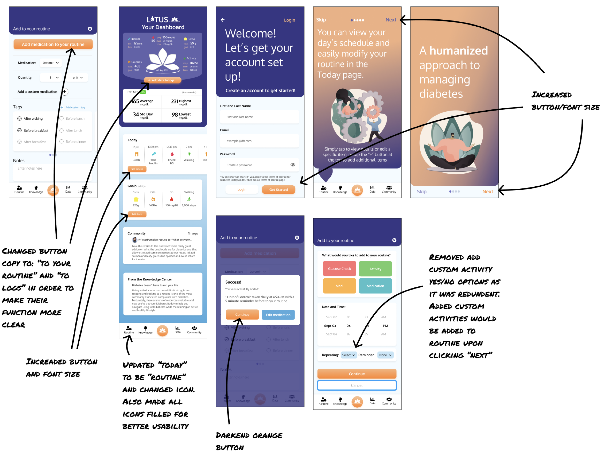
After completing the mid-fidelity wireframes they were used to create a prototype using Figma and tested with potential users via Zoom and in-person. The prototype was tested with five (5) users and received largely positive feedback. The findings are presented and summarized in the Usability Test Results report.

Examples of revisions are displayed below:
Image

Branding


Logo Design

From Diabetes Buddy to Lotus
Image
Diabetes buddy with the heart logo was the first iteration of logo design. However, upon locating a graph that looks like a flower that would be used in the app, the lotus design was incorporated into the logo concepts. This new direction further distinguishes the app as being different from other diabetes applications and allowed for the gamification of the users' goals.

Final Designs


High-fidelity Wireframes

The high-fidelity wireframes were designed based on the usability test findings. I wanted to create a UI that was easy to navigate while also humanistic -- providing a sense of community, safety, well-being, and control. The usability test revealed specific flaws in the app which were then revised for the final high-fidelity wireframes.
Onboarding and Account Creation: The first onboarding sequence is designed to provide an overview of the main ways the application will help diabetics manage their condition. Immediately following this are the account creation screens.
Feature Overview: This second onboarding sequence briefly instructs new users by going over the features of the application and where they can be found within the app.
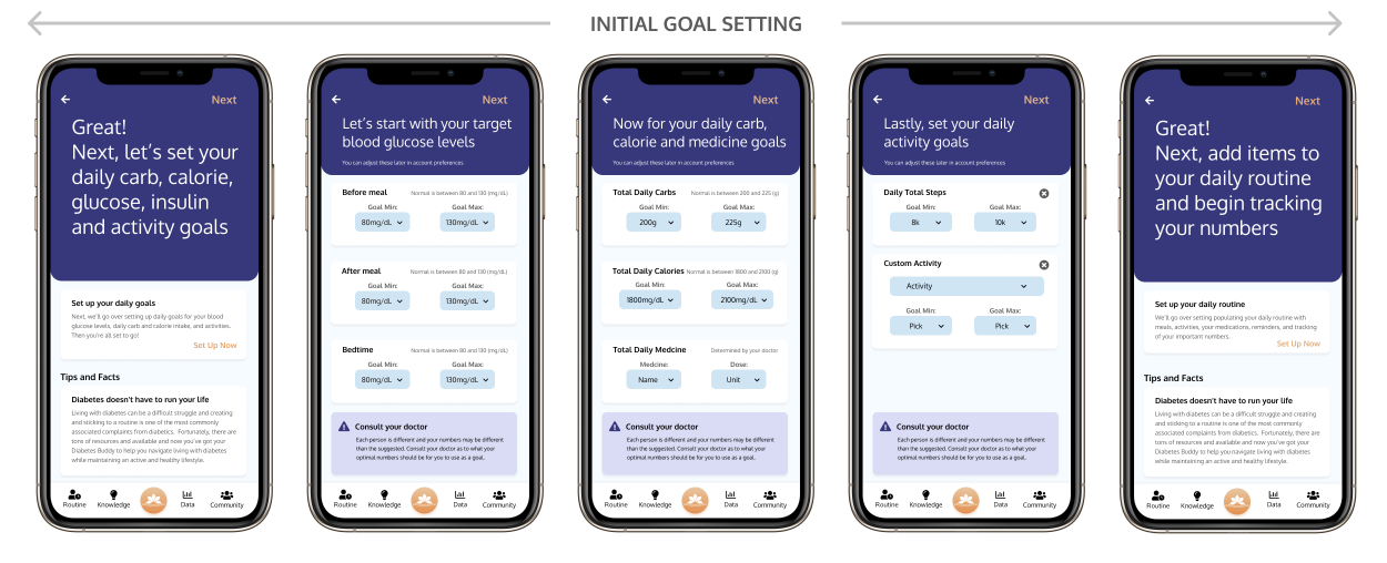
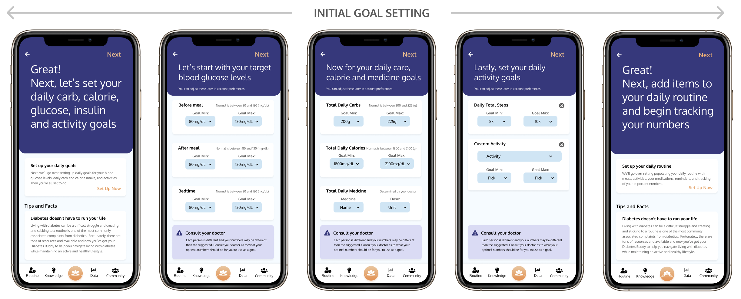
Initial Goal Setting: The Goals Setting sequence immediately follows the Feature Overview sequence and prompts the users to input their goals right away. Goals are an integral part of the app as they are tied to managing the disease properly.
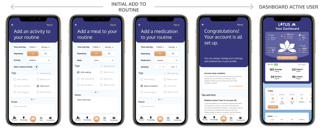
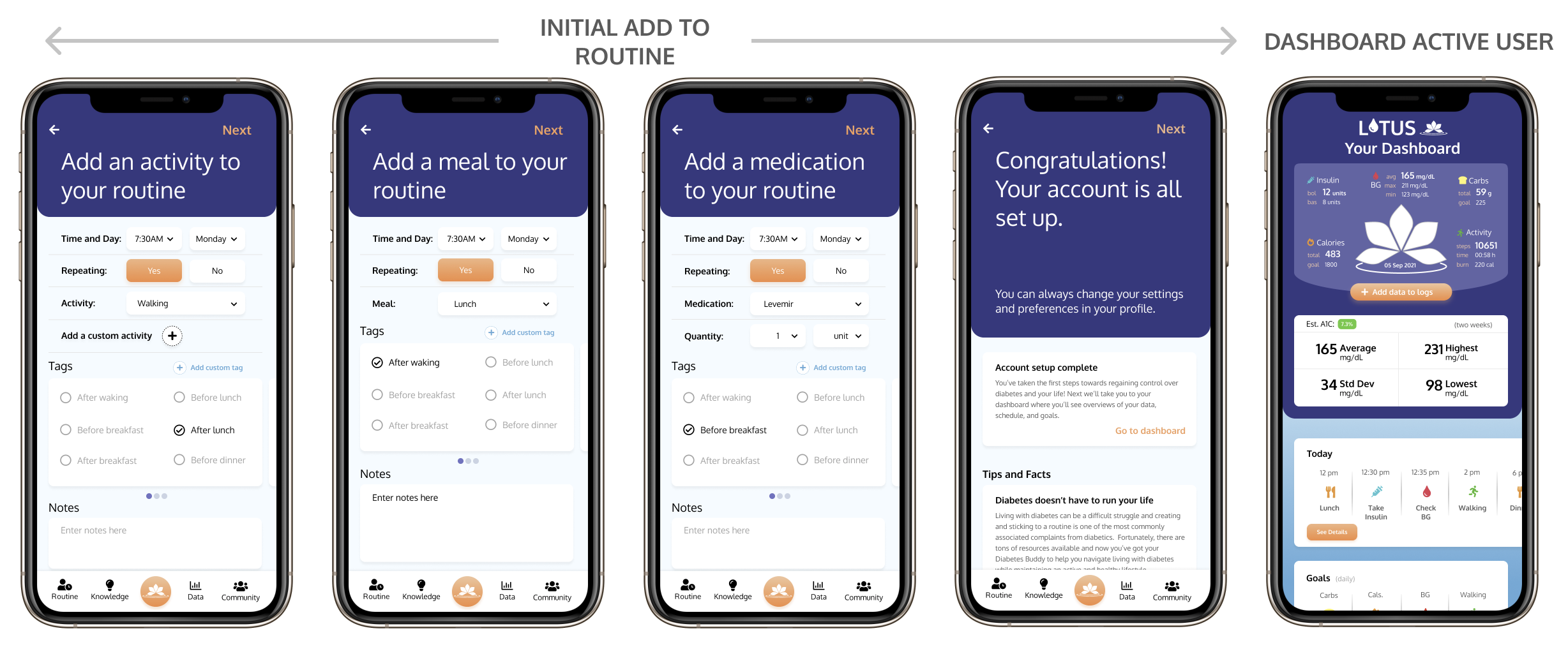
Initial Add to Routine: Following the Goals Setting sequence the user is prompted to add a meal, activity, and medication to their daily routine.
Add Data to Logs and Add to Routine (Active User): The following sequences show how active users would add data to their logs and add to their routine.
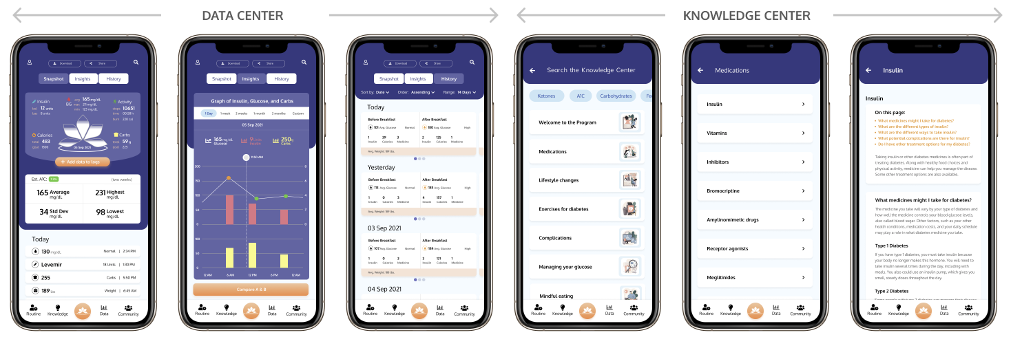
Data Center (Active User): These screens show the data and tracking center of the application. Users can view their data as a snapshot, insightful detailed charts, or historically.
Knowledge Center (Active User): These screens illustrate how a user can gain knowledge about diabetes in the application.
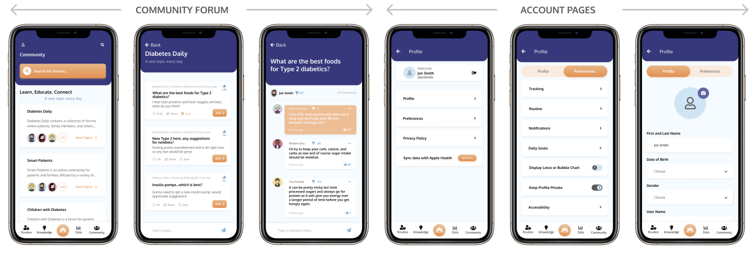
Community Section (Active User): The Community Section provides a sense of togetherness and facilities the dissemination of knowledge. This section plays an important role for all diabetics, but especially newly diagnosed individuals.
Account Pages (Active User): The account pages are the settings hub of the application.

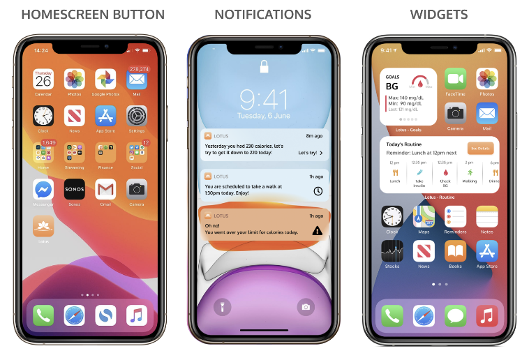
iPhone Screens (Active User): There when they need it, but doing the heavy lifting associated with managing the disease in the background. To that end, notifications and widgets can be utilized by users.

Staying up to date with their condition while maintaining their routines is critical for diabetics and these features allow users to do just that but more easily.

Next Steps


Research indicates users prefer a softer more humanized experience when using medical applications. This is particularly true for serious illnesses. Further humanizing the app could be achieved by including popups at specific times to help "guide" a user, especially newly diagnosed individuals.

Popups could be used to help facilitate getting to know the app and how to use it. These could be triggered automatically, or initiated by the user.

A robust guide that can walk users through their type of diabetes from newly diagnosed individuals to users with many years of experience managing the disease.