Las Margaritas

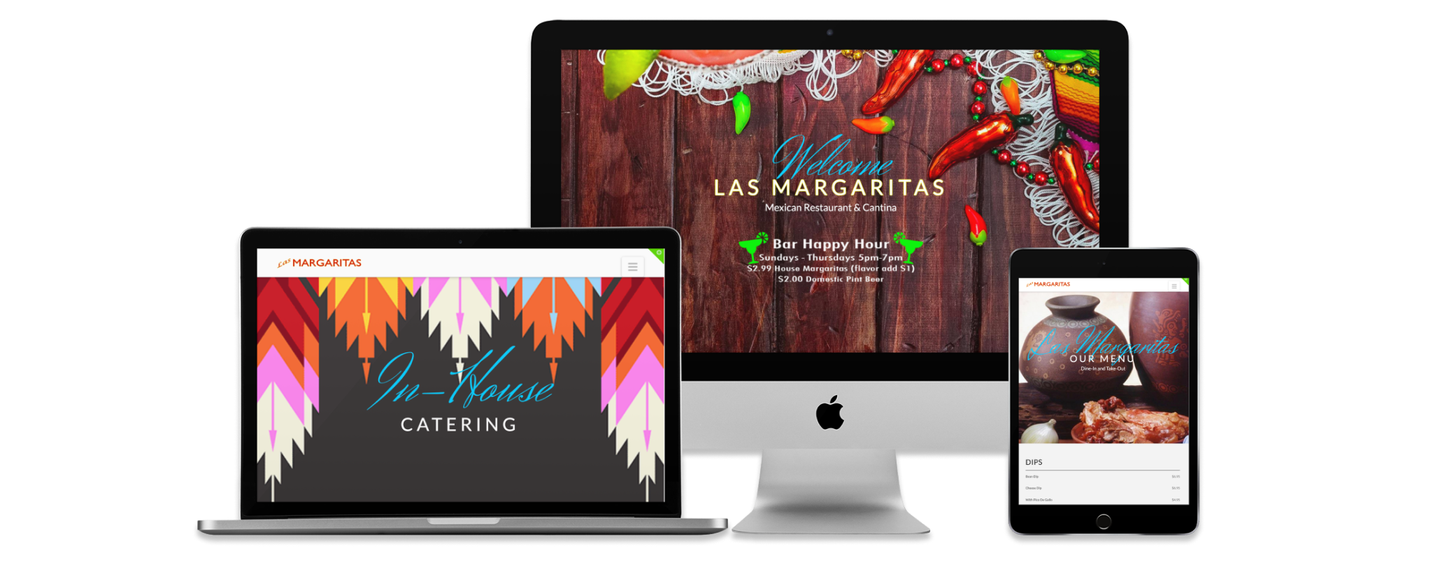
Responsive Website
Image

Role

UX Designer (Contract)

Client

Las Margaritas

Industry

Food Service

Scope

Responsive Website

Design Tools

Photoshop
Illustrator

Awards

CSS Nectar - Site of the Day
Webneel - 50 Beautiful Websites
Whohit - Building a Restaurant Website with WordPress

Problem


Las Margaritas is a successful Mexican restaurant with two locations in the Philadelphia, Pennsylvania region. Despite their popularity, they did not have a website. As a new freelancer, I decided to reach out to the owners and offer my services. After meeting with them, it was clear the restaurants needed a website that was authentic and served the needs of both the business and its customers.

Solution


Research was conducted which included a visual ethnographic study of the physical locations, interviews, and usability testing. Once the needs of the business and the users were defined, a website was created with testing conducted immediately following initial designs. The designs were then iterated and refined. After launching the website, it received distinction from several 3rd party organizations for its visual appeal.

Constraints


Branding 
Due to the restaurants being established for some time, basic branding already existed. This included a logo, fonts, and colors. The new website would need to seamlessly incorporate these existing branding styles in order to be successful.

Authenticity
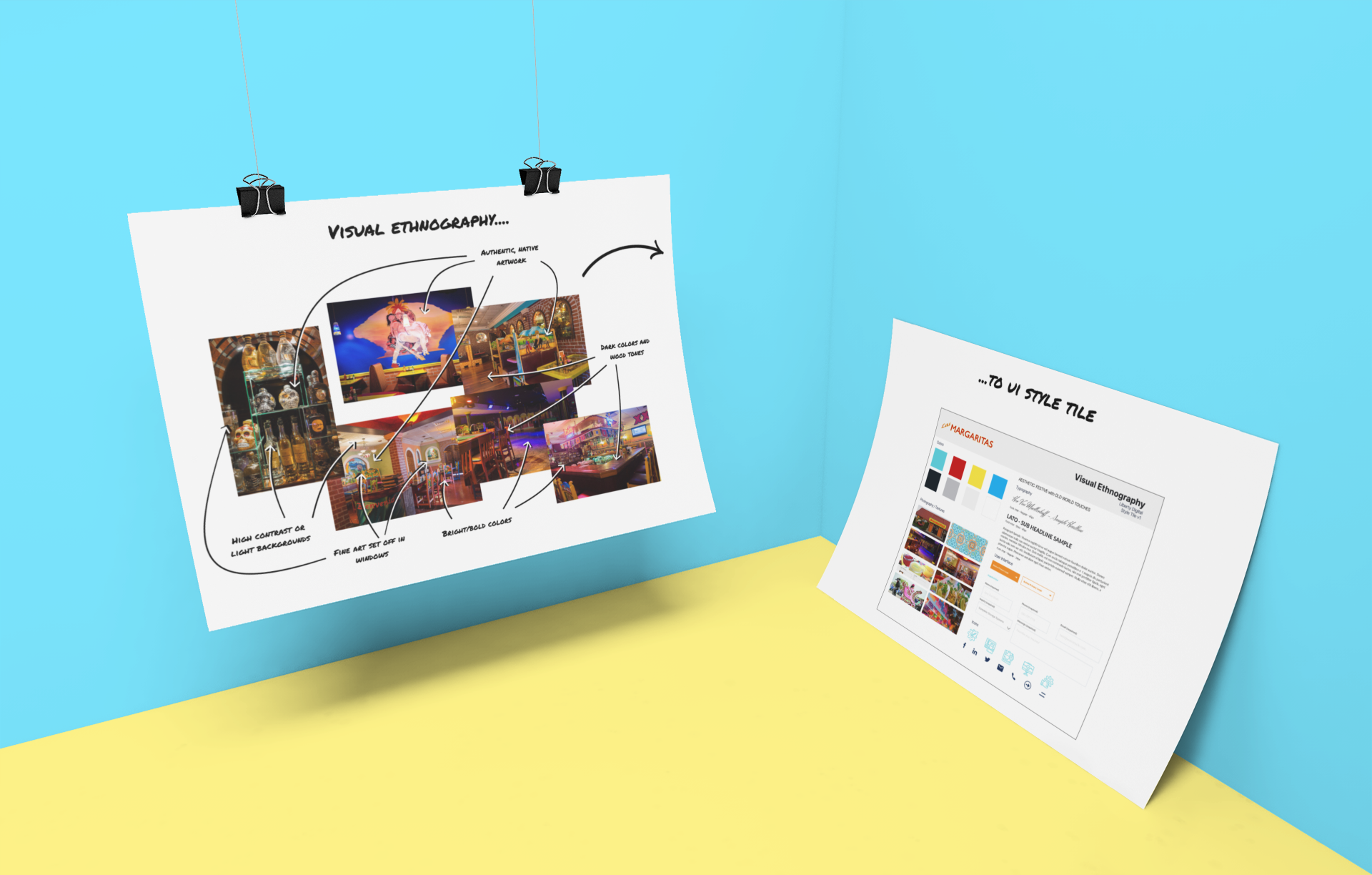
Paramount to both the stakeholders and users based on preliminary interviews, was the need for the website to provide the same look and feel as the physical locations. In addition to other research methods, a visual ethnography was conducted that defined the colors, patterns, fonts, etc. to be used in the user interface.
Image
MY FIRST WEBSITE EVER FOR A CLIENT

Research


Explore

  • Visual ethnography of restaurant locations
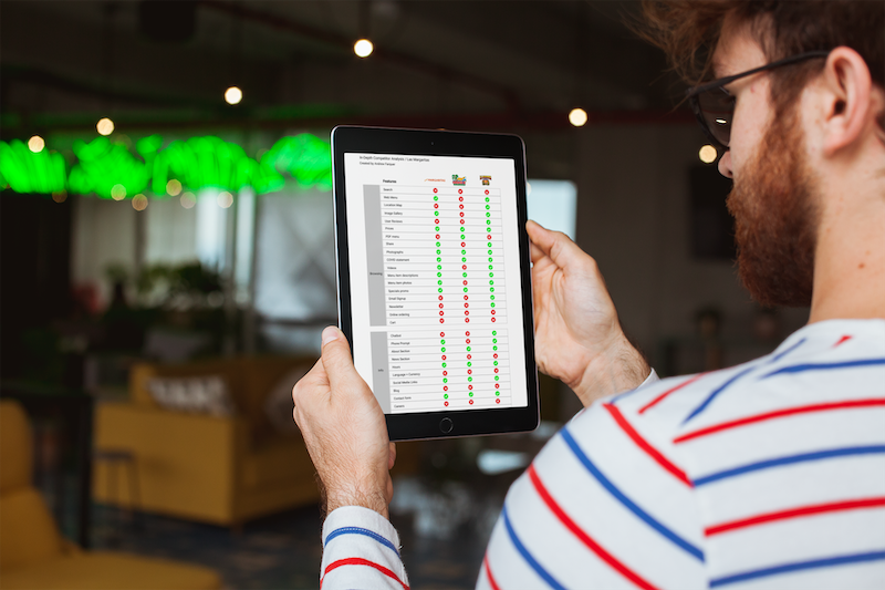
  • In-depth competitor analysis of existing Mexican restaurant websites
  • Competitor analysis of other restaurant websites (non-Mexican)
  • Preliminary open-ended interviews with likely users
  • Persona development
Image

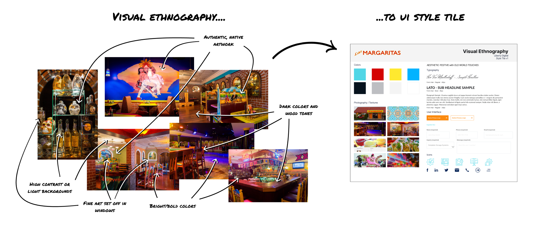
Visual Ethnography to User Interface

Image
  • Colors and patterns displayed within the locations
  • Fonts, weights, strokes
  • Overall aesthetic look and feel summarized
  • Pinpoint to specific characteristics in photos that will comprise the User Interface
  • Creates an authentic digital representation of physical locations

Competitor Analysis

  • In-depth analysis of Mexican restaurant websites from the continental US
  • Analysis of restaurant websites, regardless of ethnicity
  • Prioritized key aspects
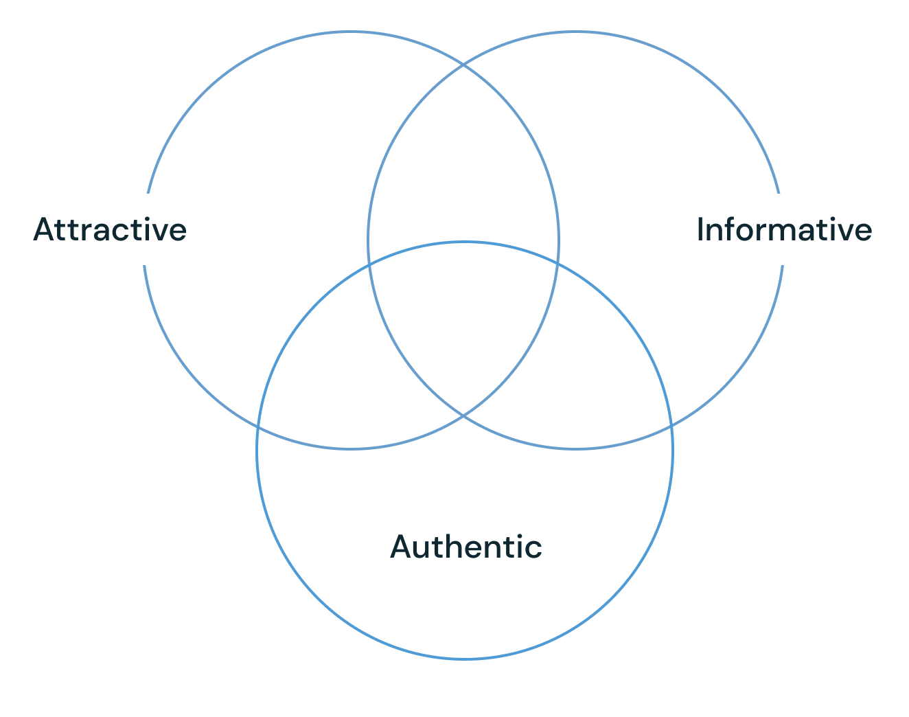
  • Combined critical features and design concepts into a central theme
Image

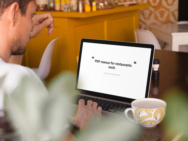
Interviews

Image
  • Determine top characteristics desired by users
  • After viewing the website, what would prevent users from going to the restaurant?
  • Potential customers and stakeholders were interviewed
  • Define usage scenarios

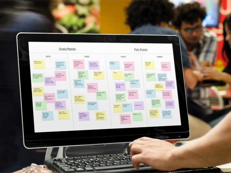
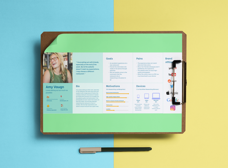
Persona Developement

  • Top persona defined
  • Motivators
  • Pain points
  • Device usage
  • Goals and frustrations
  • Biography and personality traits
  • Favorite brands
Image

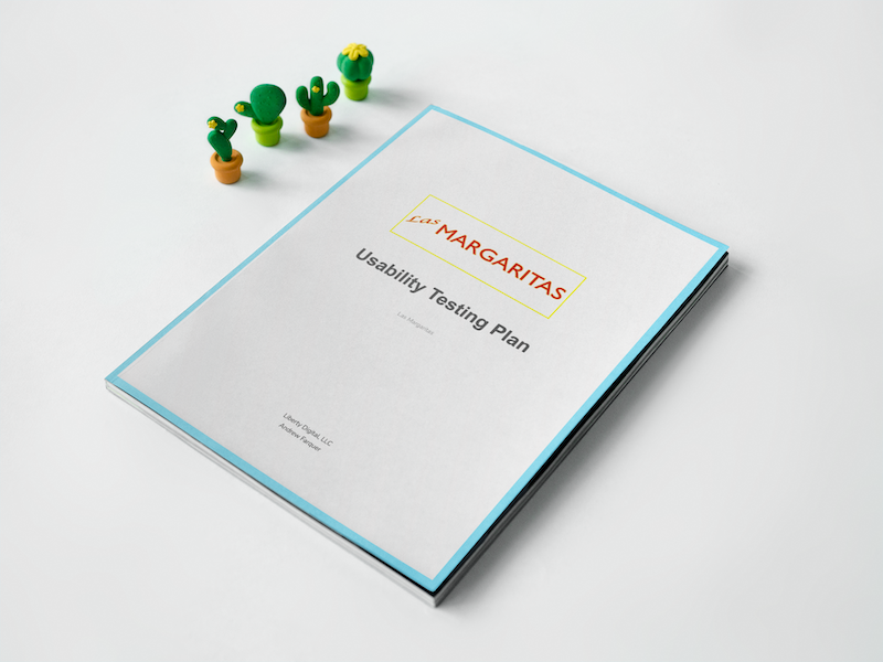
Usability Testing

Image
  • Evaluate overall interactions users have with the website
  • Identify and define pain points
  • Identify successes and weaknesses of the user flows
  • Iterations based on feedback from users

Ideation


Problem Statement

Las Margaritas needs a website to represent the business online. Customers are frustrated with the inability to get basic information about the business or its menu. A new website should be created that will act as an information and marketing hub for the restaurants. It also needs to authentically represent the restaurants -- a mirror of the experience offered by the physical locations.

Cases

Image

"I want to look over the menu and pictures."

Image

"I want to learn as much as I can about the restaurant before I go."

Image

"I need to contact the manager or leave a bad review if I can't."

Image

"I want to see what the restaurant offers besides dinner and takeout."

Themes

Image

Visual Ethnography to User Interface

A visual ethnography was conducted during the research phase of the project. Its findings are presented below and were used to create the User Interface to ensure authenticity.
Image

UX Flow

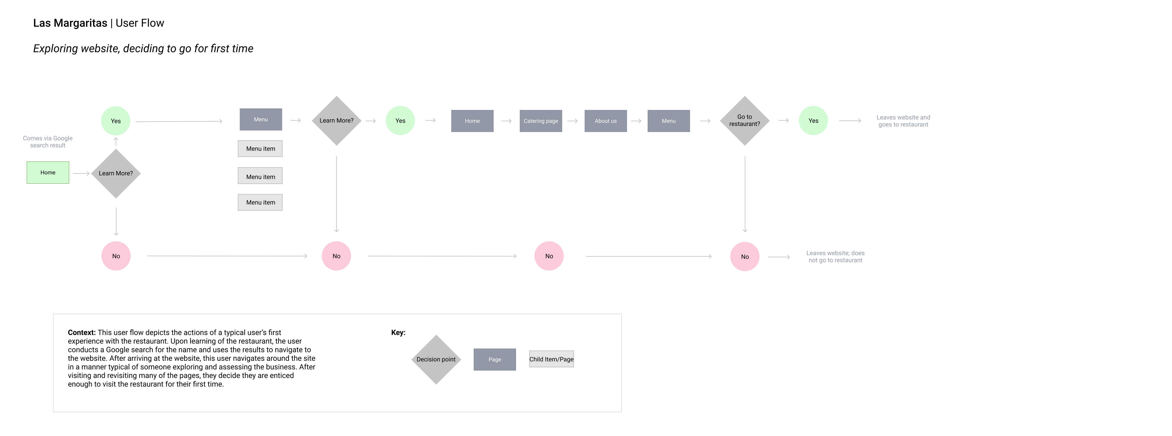
User flows were developed as part of the research conducted for this project. Below is a typical user flow of someone exploring and assessing the business for the first time after receiving a recommendation to go for dinner.

Arrive via organic search, explore, assess
This user flow depicts the actions of a typical user's first experience with the restaurant. Upon learning of the restaurant, the user conducts a Google search for the name and uses the results to navigate to the website. After arriving at the website, this user navigates around the site in a manner typical of someone exploring and assessing the business. After visiting and revising a large number of pages, they decide they are enticed enough to visit the restaurant for the first time.
Image

Iterations


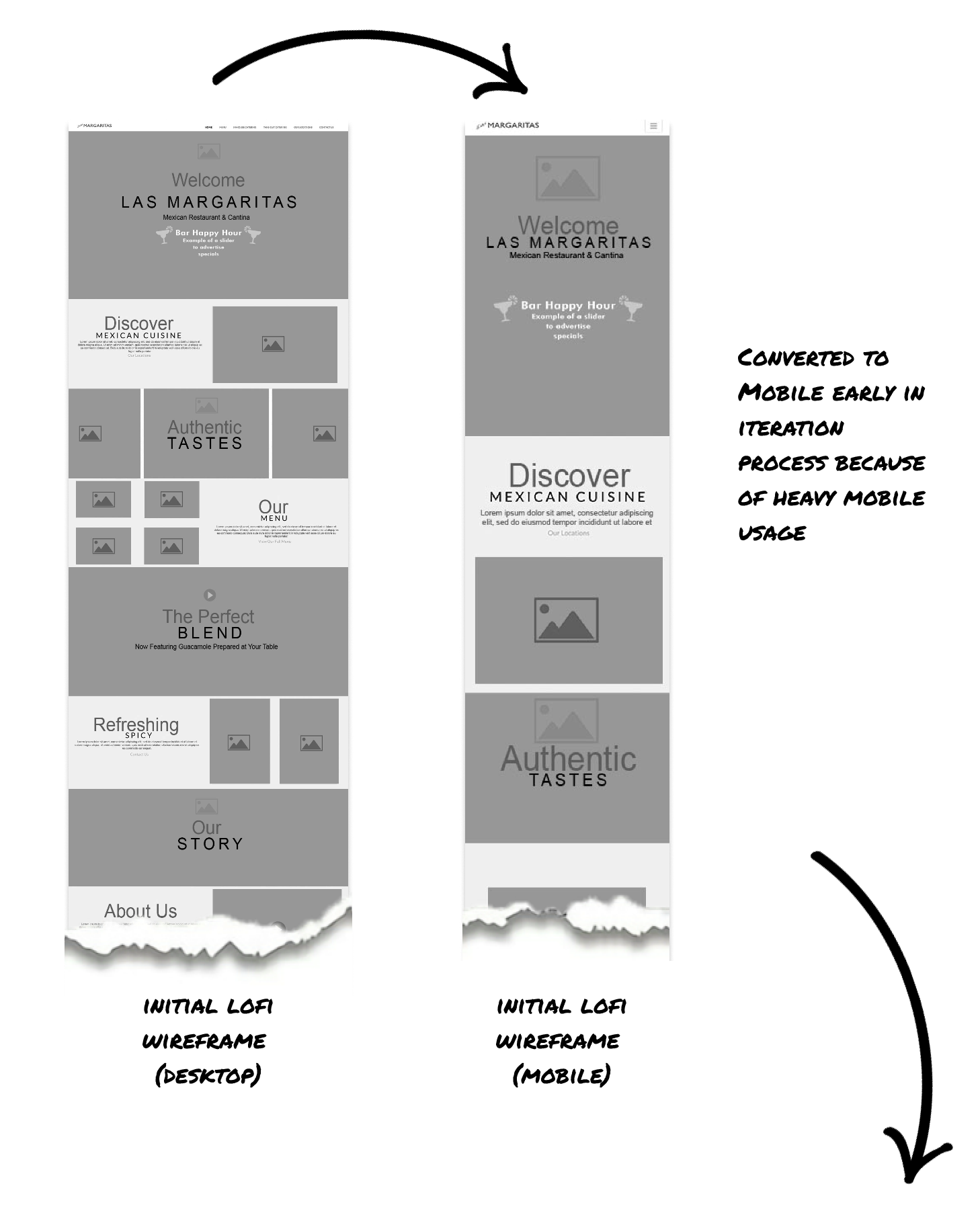
Low-fidelity Wireframing

ImageImage

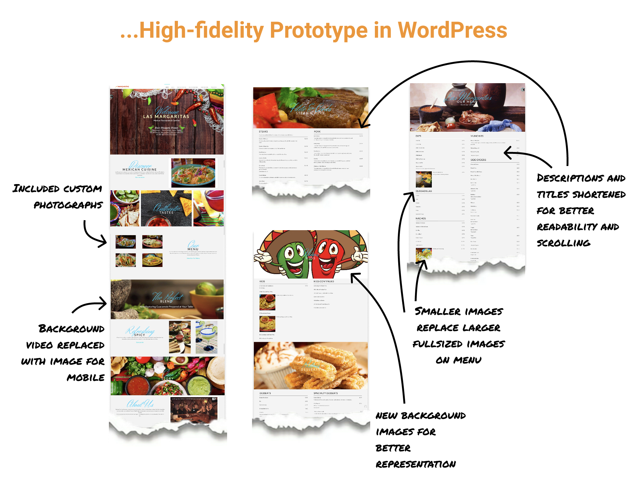
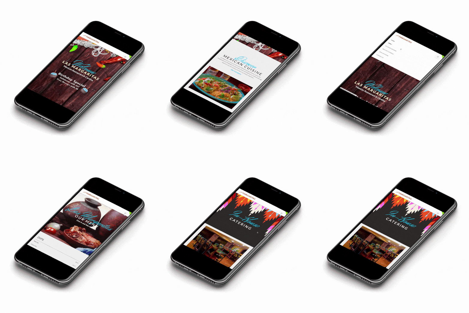
Final Designs


Reflections


This was the website that launched my design career. 

For my first project as a freelancer, this was a rewarding experience that began my design career. Las Margaritas was a joy to create and allowed me to utilize both newly acquired and well-established skills. Stakeholders and patrons alike were thrilled with the results and the site has received notoriety for its design.
Image